Mental Health Access
Visualizing the Imbalance Between Suicide Risk and Treatment Access
Graphic Design
Visual Storytelling
Illustration
Motion Design

Project Overview
A data-driven visual system examining how mental health treatment access declines across age groups in the U.S., despite rising suicide risk. Audience : general public, patients, and families
Client
Academic Project (SCAD)
Duration
2 months
Role
Graphic Designer
Problem
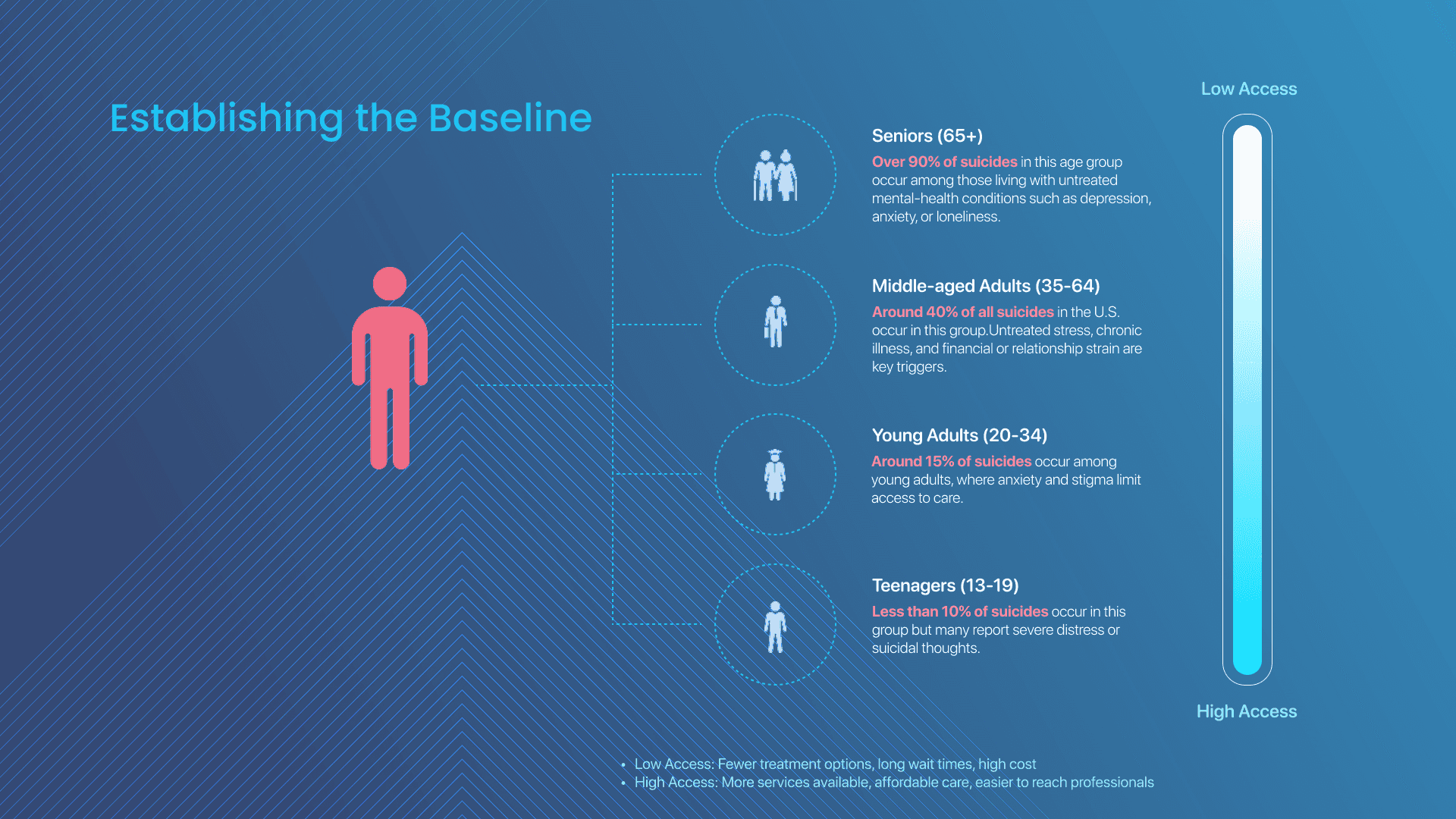
Although mental health data exists in reports and research, the gap between suicide risk and treatment access across age groups is not easily visible to the public. Complex statistics make it difficult for people to recognize where support is most lacking.
Deliverables
Research & process documentation
Concept development
Ideation sketches
Final digital illustration
Process
To communicate the idea, the final design uses a natural growth metaphor. I went into the different design directions, but the idea of natural growth make a lot more sense to represent different stages of life. That’s why the flower structure was used to communicate the concept.
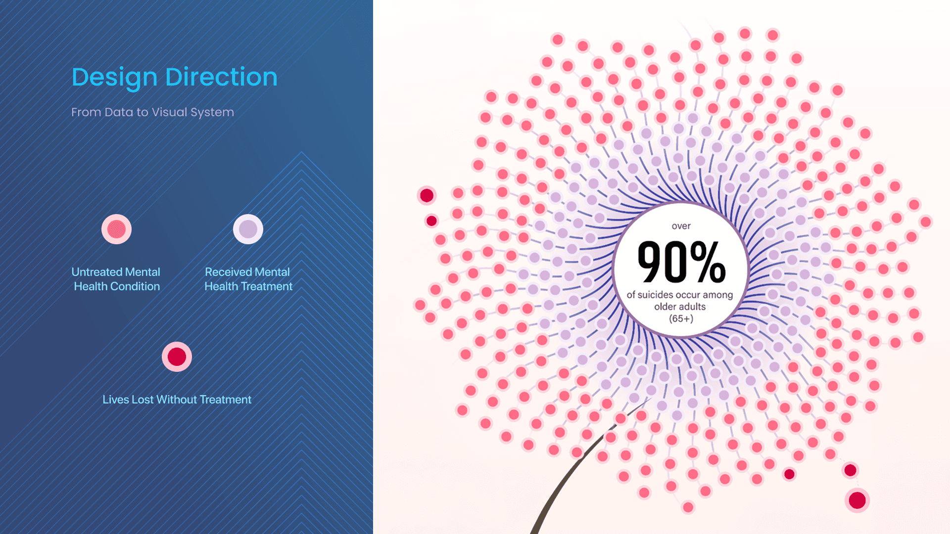
Each dot represents a person. Pink dots show people living with untreated conditions, while purple dots represent people receiving care. The gradient from the center outward shows the strength of access to treatment. So instead of reading through number, people can immediately see where support begins to drop off.
This system first appears as a motion piece on billboards to capture attention.
In the animation, red dots fall away from the plant, representing lives lost when treatment isn’t accessible. Because viewers might only see the billboard for a few seconds while driving, the message needed to stay simple and immediate. The key takeaway is just this: access to care matters.
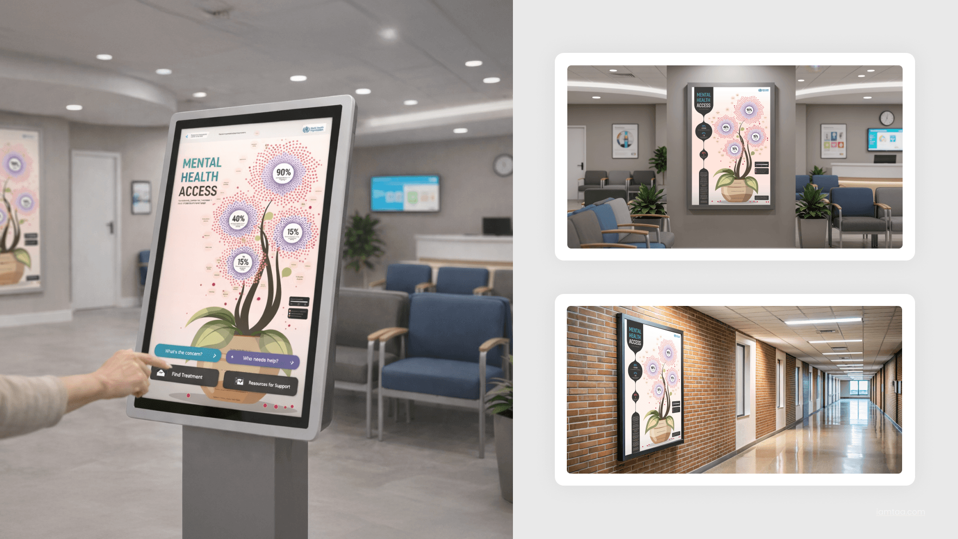
Poster Design
The design continues into posters or kiosks in clinics, where people can explore the information in more detail. The poster also provides practical resources, so if someone is struggling, they can immediately find support. The goal is not just awareness, but also helping people take action through the resources included directly on the poster.
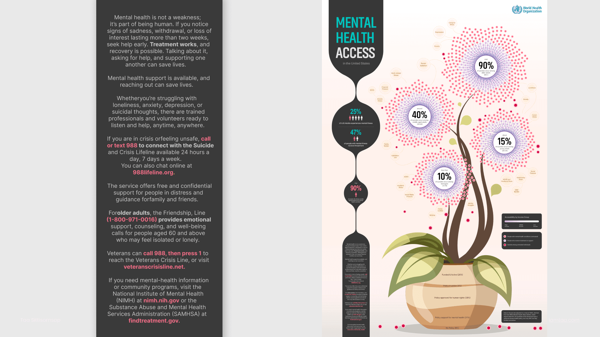
The design makes the gap between suicide risk and treatment access immediately visible, helping people understand the issue quickly while guiding them toward available support resources.
Tool Used
Figma ✦ Adobe Photoshop ✦ Adobe Illustrator ✦ Adobe After Effects