Get Valet App
Designing a consumer mobile experience for valet services
UX/UI
Mobile App
Service Design
User Flow

Project Overview
Get Valet is a mobile application designed to simplify the valet parking experience for everyday users. Originally developed as a capstone project at General Assembly in Atlanta, the project was completed in collaboration with a real client building a valet management platform. The scope focused on redesigning the consumer-facing mobile app from the ground up while ensuring alignment with the existing corporate platform used by valet companies and staff. This project was completed by a team of three designers during a 16-day design sprint. I contributed across research, UX strategy, and interaction design, and helped organize the workflow by gathering requirements, structuring the timeline, and coordinating progress with stakeholders.
Client
GET Valet LLC
Duration
16-day design sprint
Role
UX/UI Designer
Problem
While the client had an established and well-designed corporate platform, the consumer-facing mobile experience was underdeveloped and inconsistent. The challenge was to design a clear, intuitive user experience for customers while maintaining visual and functional alignment with the existing system.
Key considerations included:
Connecting consumer actions (such as requesting a car) with backend valet workflows
Maintaining consistency in visual language and interaction patterns across platforms
Designing an experience that builds trust and scales with business growth
The goal was to bridge two user groups (customers and valet operators) into one cohesive product ecosystem.
Deliverables
Research findings
Customer journey
User Flows
Ideation sketches
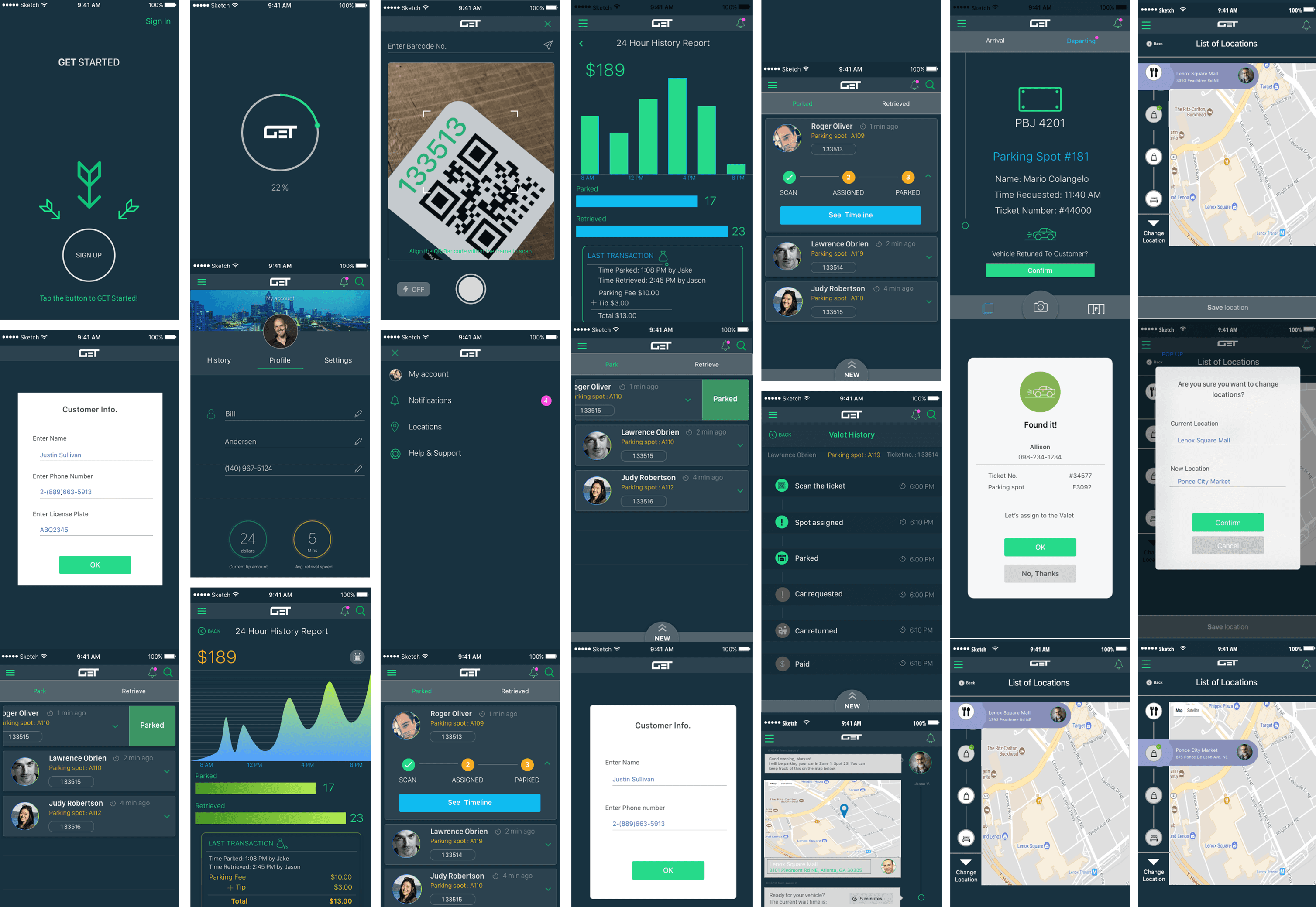
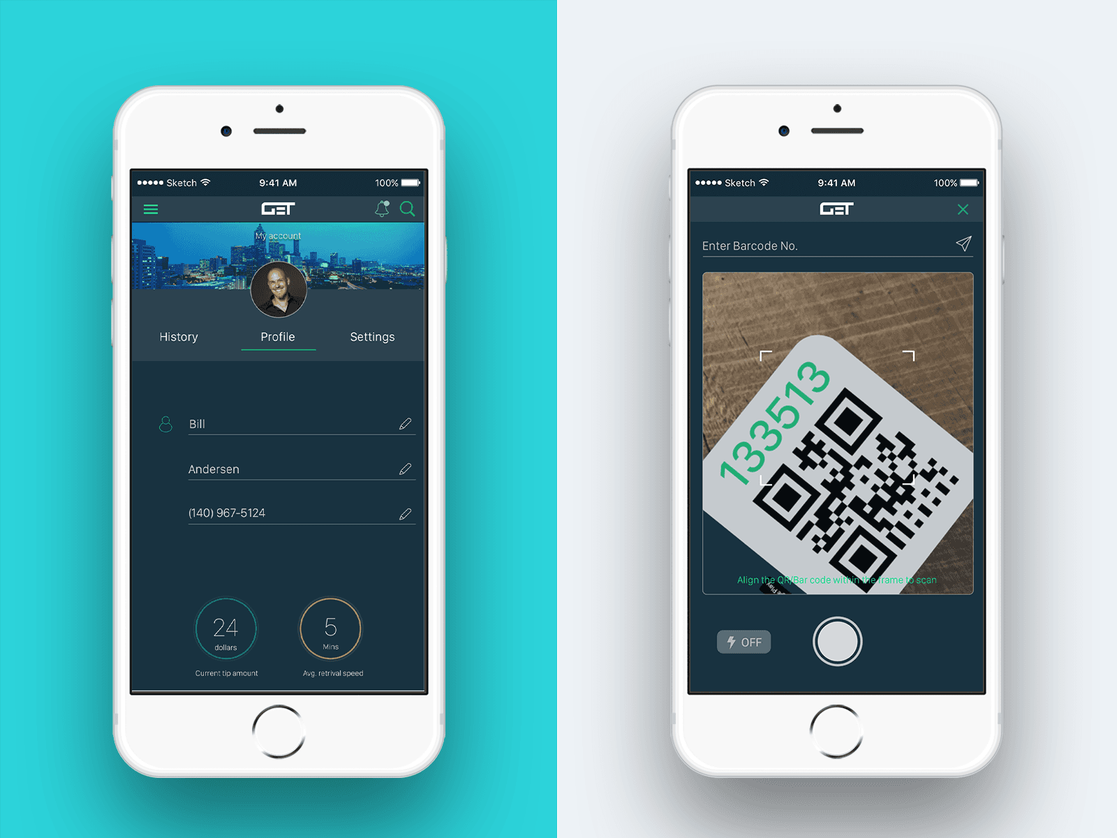
Wireframes
High-fidelity prototypes
Process
Research & Analysis
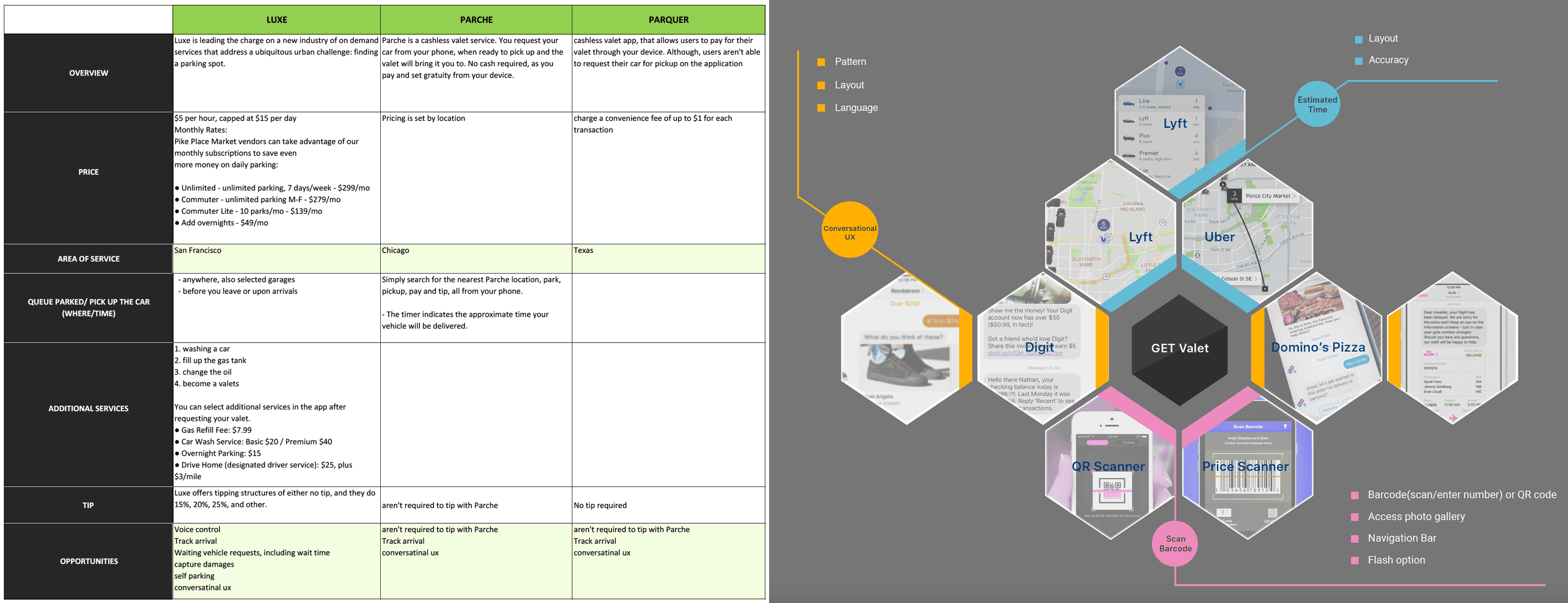
We began with competitive and comparative research across valet and parking applications to understand common patterns, feature expectations, and usability gaps. App store reviews and existing user feedback were analyzed to identify recurring pain points, particularly around onboarding, status clarity, and real-time updates during the parking experience.
2. Problem Framing & User Needs
Insights from research revealed that users needed reassurance, clarity, and speed during time-sensitive parking moments. Key needs were defined around:
Clear status updates throughout the valet process
Minimal steps for core actions such as requesting or retrieving a vehicle
Transparency around timing and vehicle location
A consistent experience aligned with the existing corporate platform
Journey Mapping
I created a customer journey map to visualize the end-to-end experience from arrival and drop-off to vehicle retrieval. This helped identify friction points and opportunities for improvement, such as better notification timing and clearer service states.
To align stakeholders, I also created a simple system visualization illustrating how consumer actions connect to valet operations behind the scenes.

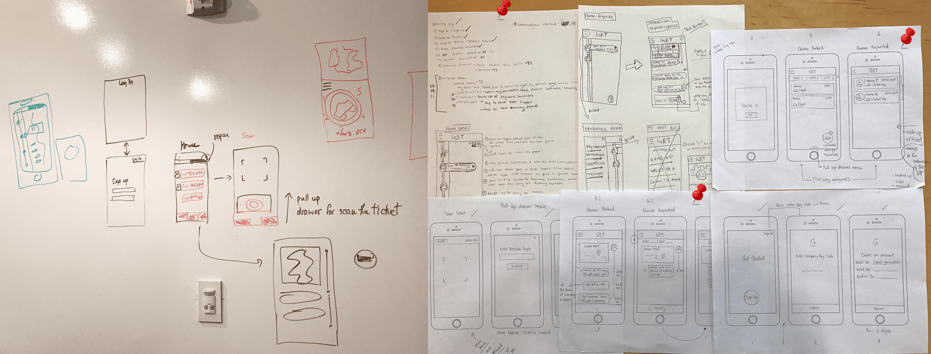
Ideation & Sketching
Early sketches were used to quickly explore layout ideas, interaction patterns, and flow options. This phase allowed rapid experimentation with different approaches to onboarding, vehicle requests, and notifications before committing to structured wireframes.
5. System Thinking & Flow Definition
Before moving into detailed wireframes, we aligned on how the entire system functioned behind the scenes. I created a simple animation to visualize how customer requests, valet operations, and station coordination interact, ensuring shared understanding across the team and stakeholders. The animation illustrates:
Primary valet flow — the standard, end-to-end experience
Vehicle request flow — the interaction for requesting a car
Multiple active requests (edge case) — scenarios involving overlapping or repeated requests
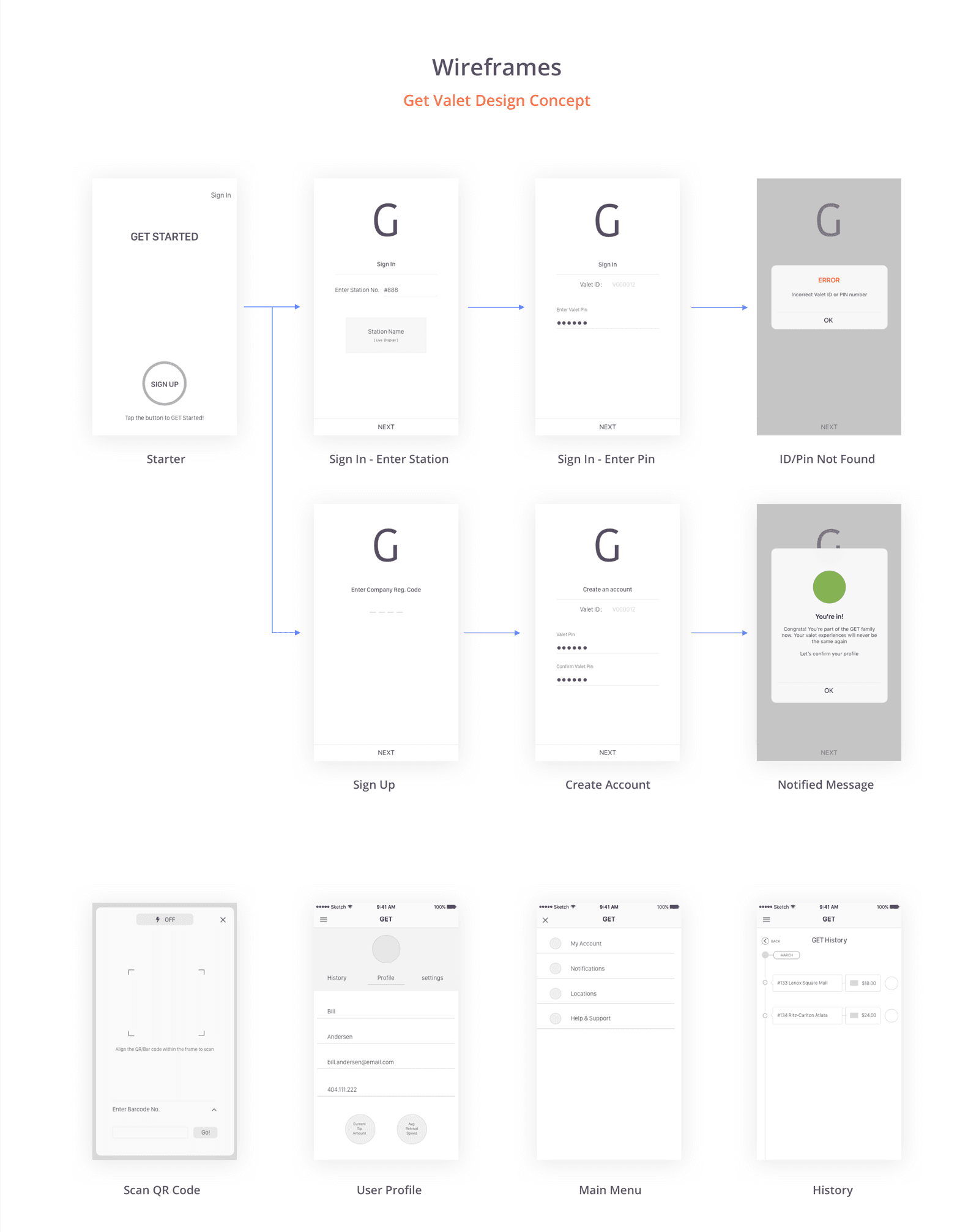
Design & Prototyping
Low-fidelity wireframes were used to explore structure and flows, with a focus on minimizing steps for key actions like requesting or locating a vehicle.
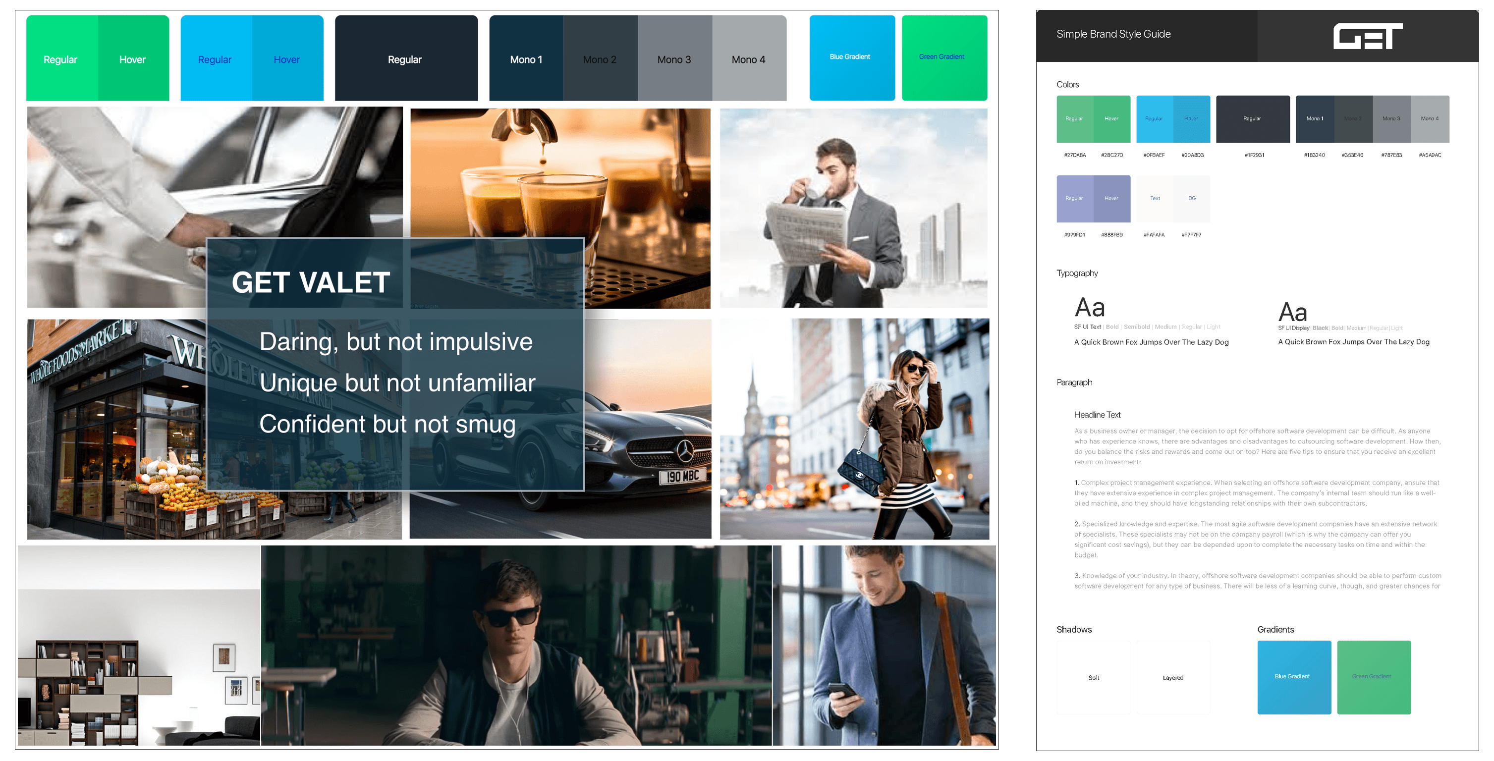
As the design evolved, I helped define a visual system through a style guide and mood board, emphasizing clarity, speed, and confidence—critical qualities for users often in time-sensitive or stressful situations.
High-fidelity prototypes were created to validate interactions and present design decisions.
A lightweight visual system was established through mood boards and a style guide to ensure consistency across screens and alignment with the corporate platform. The UI emphasized clarity, trust, and ease of use—important qualities for users often in a hurry or under stress.
Iteration & Stakeholder Feedback
Designs were iterated based on stakeholder reviews and usability feedback gathered throughout the sprint. Feedback informed refinements to interaction flows, visual hierarchy, and messaging to improve clarity and confidence for end users.
What I Learned
How to translate research insights into end-to-end user flows for a real client
The importance of system thinking when designing experiences that connect consumer actions with operational workflows
How to collaborate within a fast-paced design sprint and incorporate stakeholder feedback
Why clarity and trust are essential in time-sensitive, service-based mobile experiences
Key Takeaways
Designing across consumer and operational contexts requires strong system awareness
Early research and journey mapping lead to more confident design decisions
Clear communication is critical when working with real stakeholders under tight timelines
What’s Next
Following the capstone, I continued working on the product as a UX intern, supporting prototype presentations for investors and partners and refining designs based on real-world feedback. This phase reinforced scalability, feasibility, and business alignment.
Tool Used
Sketch App ✦ Axure RP ✦ InVision ✦ Flinto