Screen Sharing for Mobile Meeting
Designing a seamless and intuitive screen-sharing experience for GlobalMeet
Product Design
UX/UI
Design System
User Research
Mobile App

Project Overview
This project focuses on designing a seamless and intuitive screen-sharing experience for mobile users on GlobalMeet, an enterprise meeting platform. The goal was to enable users to confidently share their screens during live meetings on mobile devices while minimizing friction, cognitive load, and technical uncertainty. Through user research and iterative design, the solution balances simplicity with the complex requirements of B2B and enterprise workflows, ensuring the experience feels reliable, clear, and easy to use in high-stakes meeting environments.
Client
Premiere Global Services, Inc. (PGi)
Duration
2 months
Role
Associate Product Designer
Problem
While GlobalMeet offered a robust desktop screen-sharing experience, the mobile app did not support screen sharing at all. This limitation prevented users from presenting content during live meetings when joining from a phone or tablet.
As mobile participation in meetings increased, the lack of a mobile screen-sharing feature became a significant gap, especially in time-sensitive and high-stakes scenarios. The challenge was to design a mobile screen-sharing experience from the ground up—one that felt intuitive, reliable, and aligned with existing meeting workflows.
Deliverables
Research findings
User Flows
Wireframes
High-fidelity prototypes
Interactive prototype
Design system components
Process
1. Research & Discovery
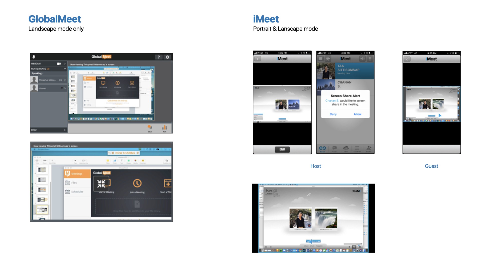
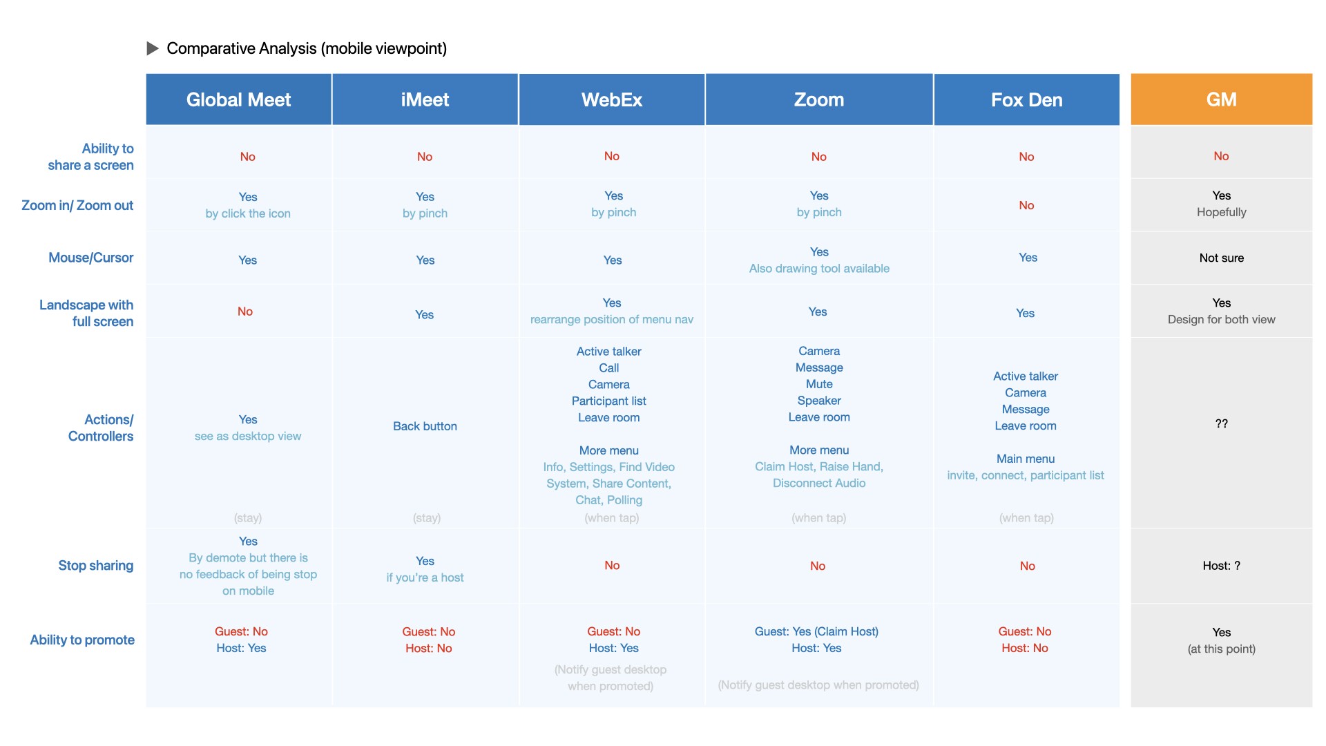
I began with a competitive audit of mobile screen-sharing experiences across platforms such as Zoom, Webex, iMeet, and GoToMeeting. The goal was to understand established patterns, common failure points, and user expectations in mobile-first, time-sensitive scenarios.
In parallel, I gathered and synthesized insights from internal feedback shared by stakeholders and frequent users, capturing real-world mobile meeting behaviors, constraints, and expectations that informed early design decisions.
Problem Framing & User Needs
Findings revealed that mobile users struggled with discoverability, confidence, and feedback when attempting to share their screens during live meetings.
Key user needs were identified:
Clear entry points for starting screen sharing
Immediate feedback on sharing status
Minimal disruption to ongoing meeting content
Predictable behavior across devices and orientations
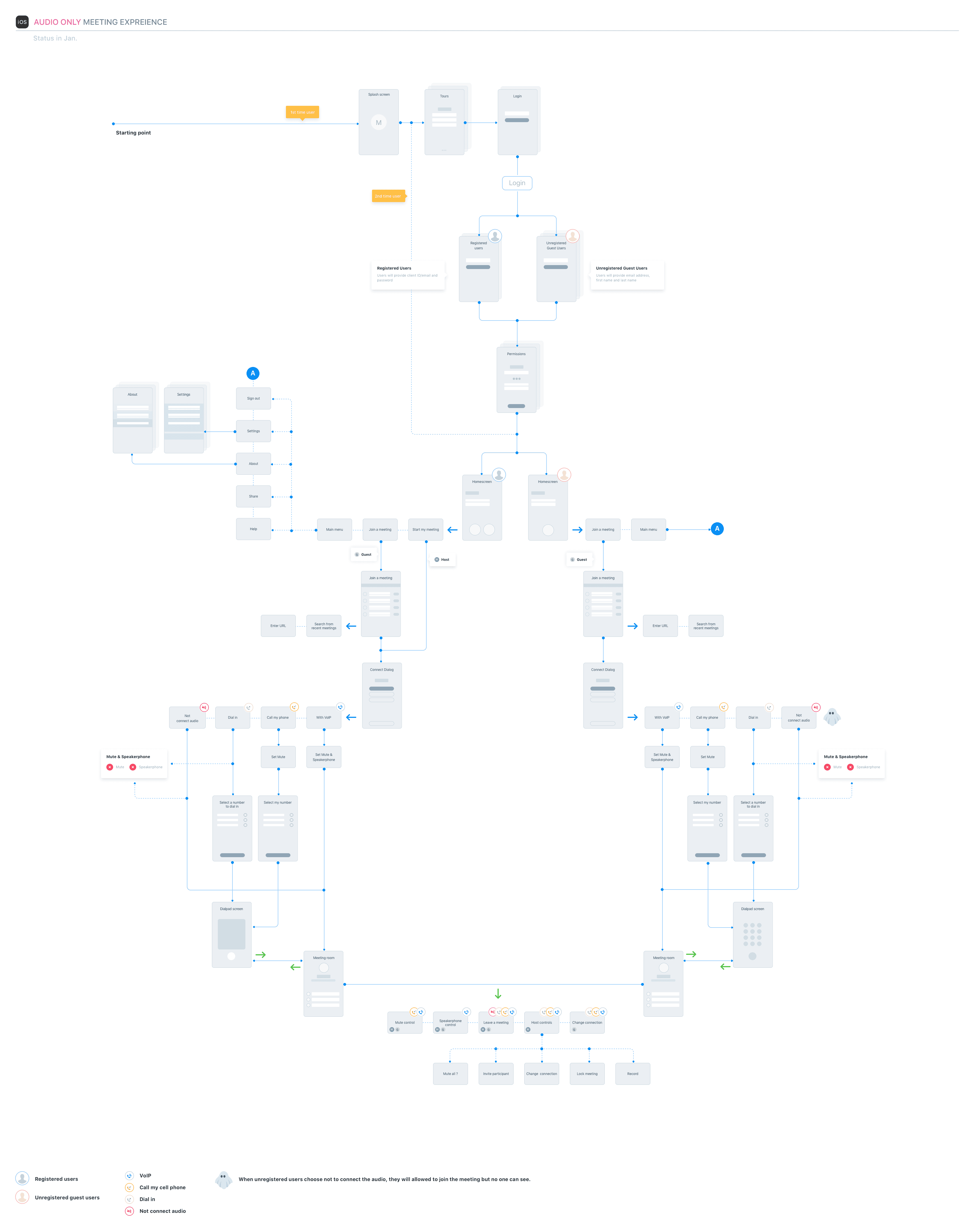
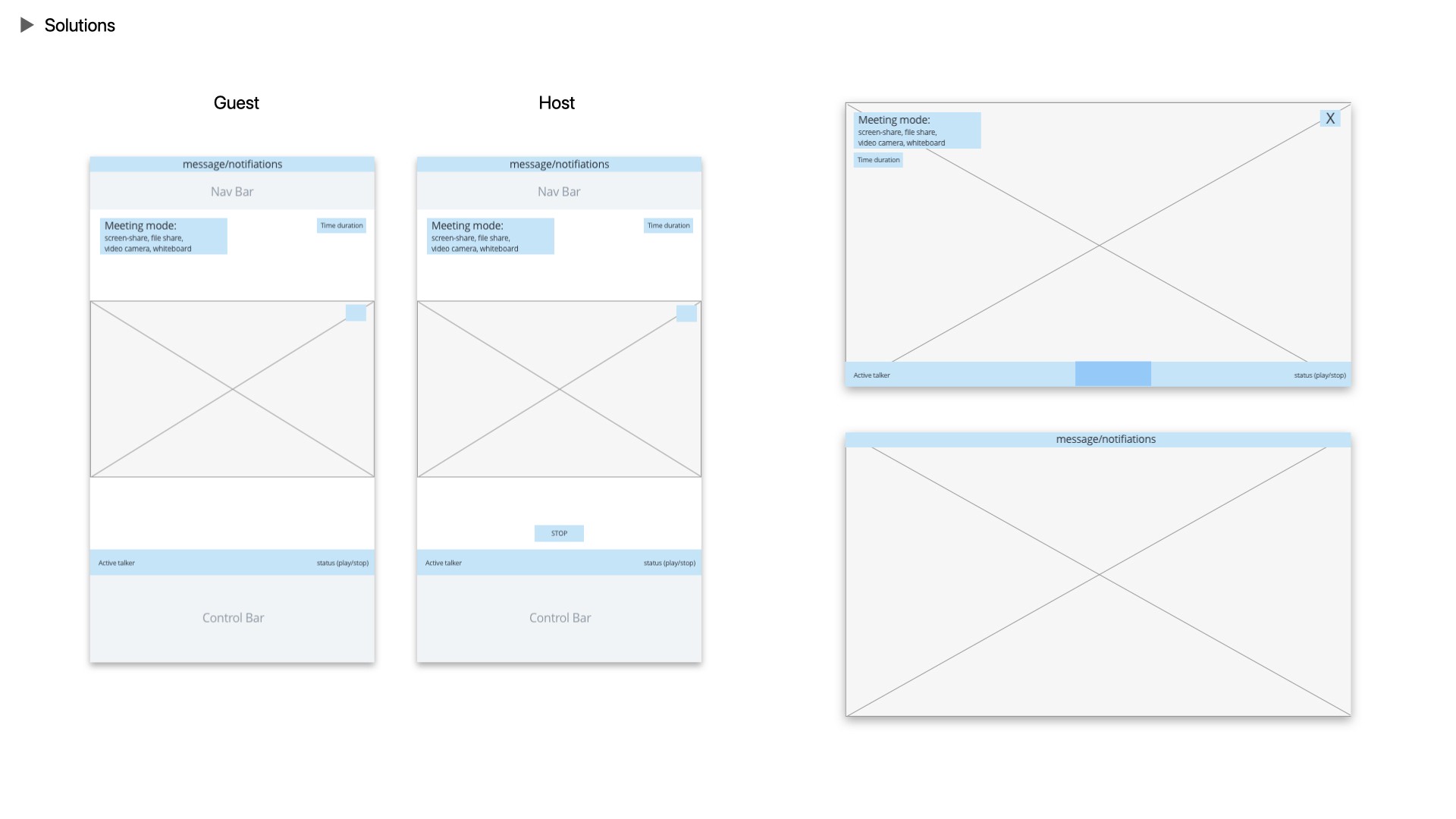
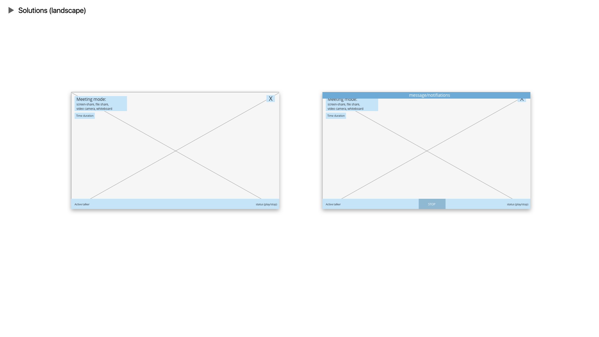
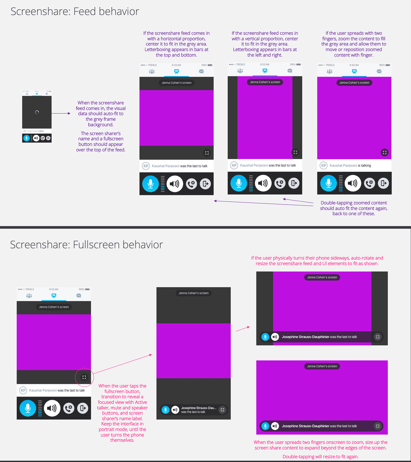
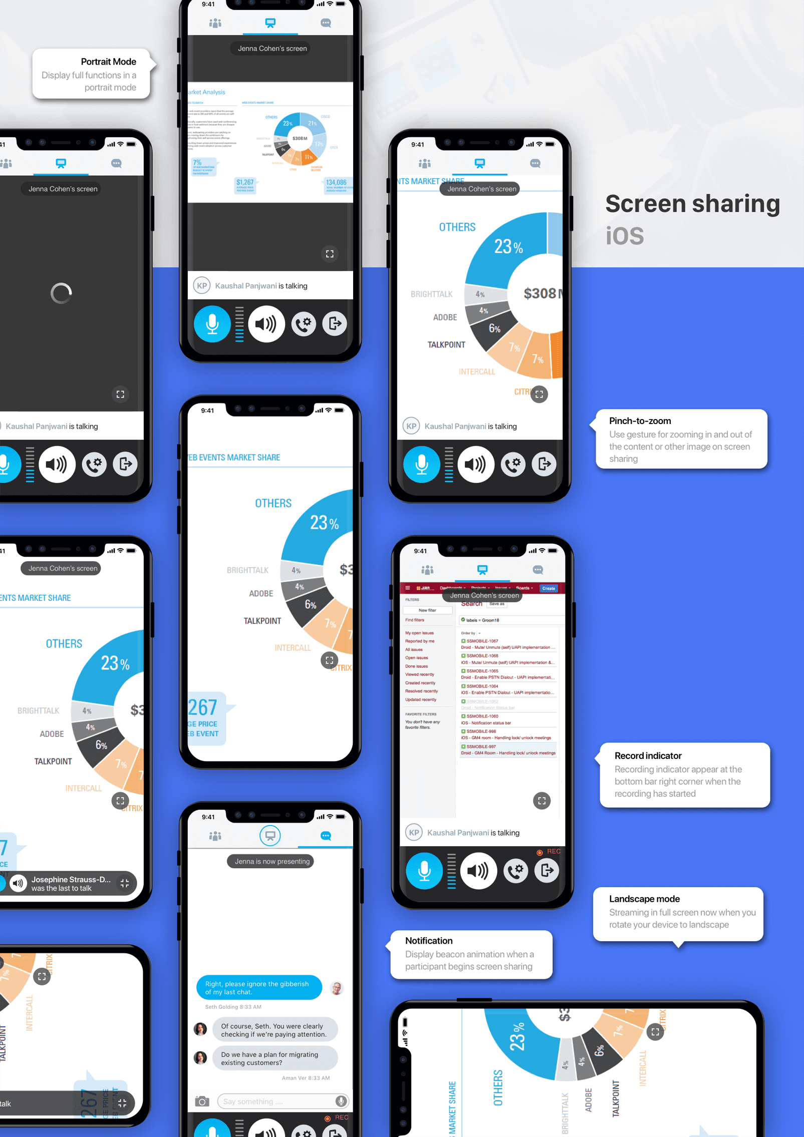
I mapped end-to-end user flows for mobile screen sharing, including edge cases such as permission handling, presenter status, and transitions between video, audio, and shared content.
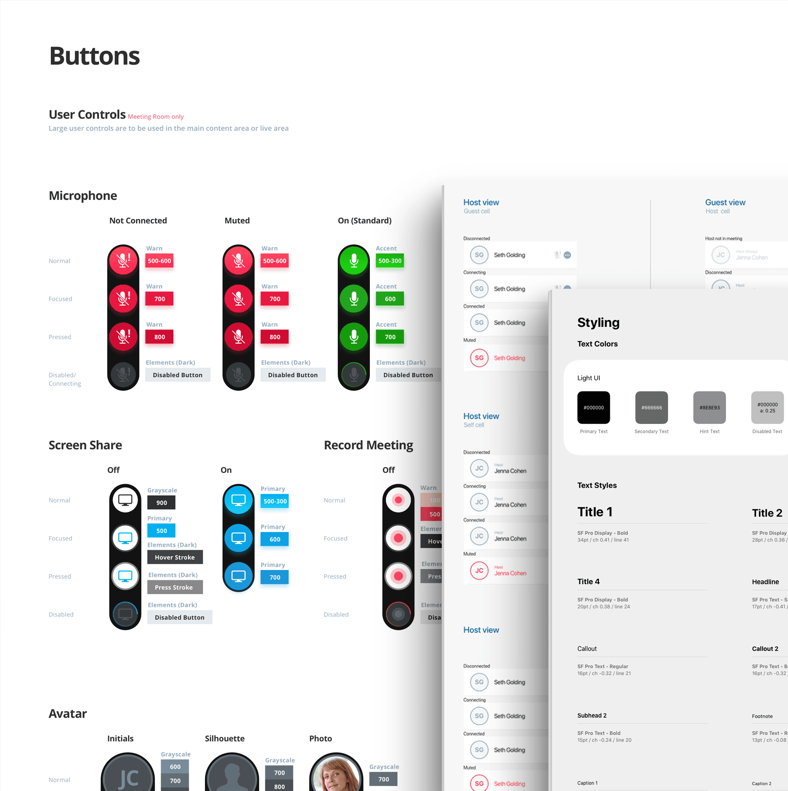
Special attention was given to enterprise requirements including:
Presenter status and visual feedback
Host controls and permissions
Notifications for start/stop events
Recording behavior and defaults
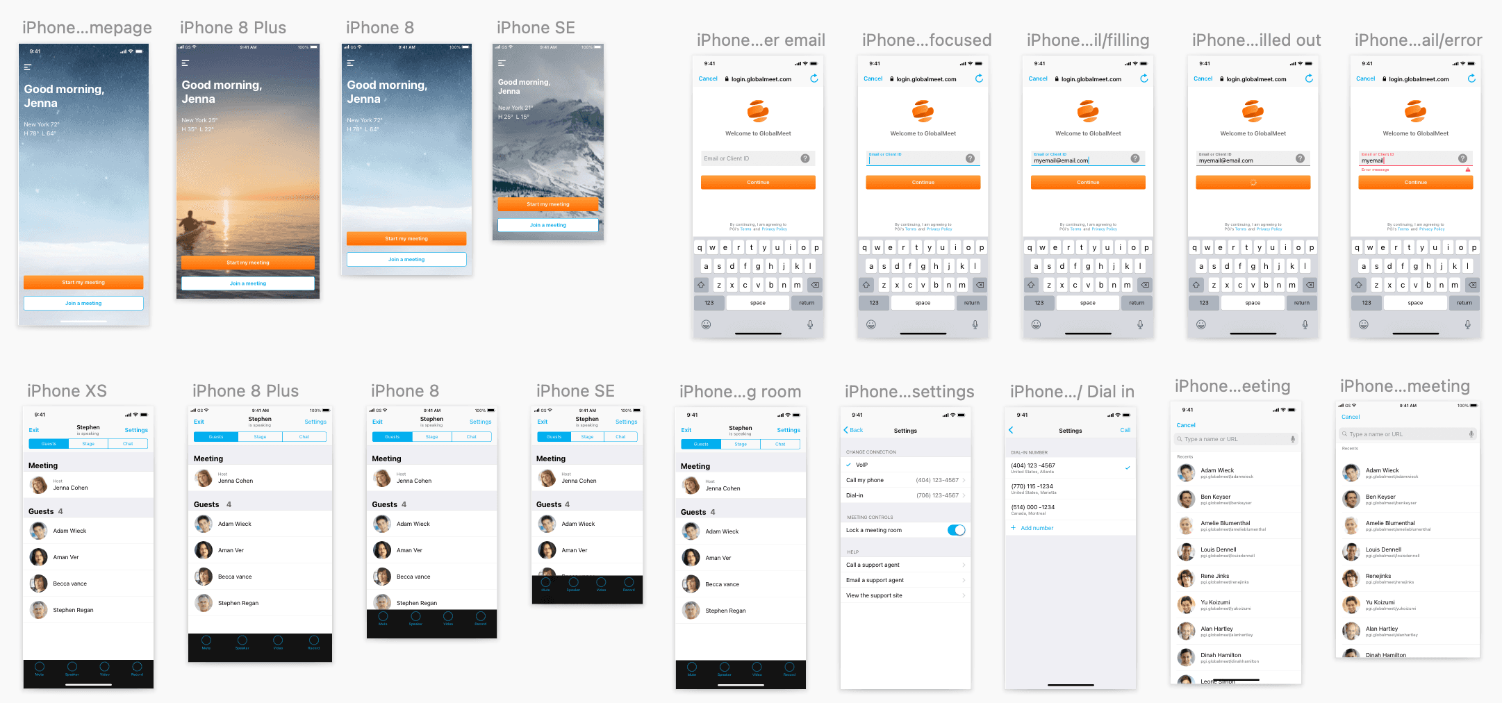
Device and orientation differences (phone vs. tablet, portrait vs. landscape)
Interaction between screen sharing and live video layouts
These considerations shaped both the interaction model and the supporting design system component
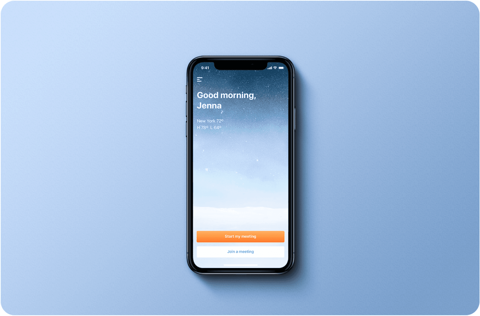
Wireframing & Prototyping
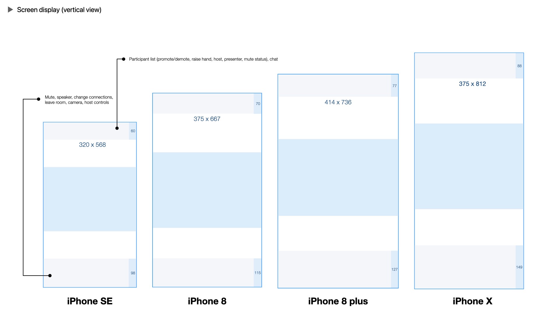
Based on the defined flows, I created low- and high-fidelity wireframes to explore control placement, visual hierarchy, and interaction clarity within limited screen space.
Interactive prototypes were used to validate assumptions around discoverability, accessibility, and ease of use before moving into refinement.
Usability Testing & Iteration
Multiple rounds of usability testing were conducted using usertesting.com, evaluating task success, clarity, and user confidence when sharing screens on mobile. Each iteration focused on reducing cognitive load and reinforcing clarity through visual cues and system feedback.
Results showed measurable improvement:
Original GlobalMeet: 61% success rate, 25% failure rate
Competitors: capped around 68% success
New designs: improved to 78%, and eventually 95% success with 0% failure in later rounds
Insights from testing informed refinements to iconography, control grouping, labeling, and feedback states.
Final Design & Documentation
This project reinforced how small interface decisions can have a large impact in complex, high-stakes environments. Iterative testing helped prioritize clarity over cleverness and demonstrated that meaningful gains often come from many small, informed adjustments.
The final design integrated seamlessly into the existing mobile app while aligning with the design system. Components, states, and behaviors were documented to ensure consistency across platforms and future scalability.
Key Learnings
This project reinforced how small interface decisions can have a large impact in complex, high-stakes environments. Iterative testing helped prioritize clarity over cleverness and demonstrated that meaningful gains often come from many small, informed adjustments.
Outcome
The final design achieved a 95% task success rate with 0% failure, significantly improving user confidence during mobile meetings. Feedback from both new and existing users indicated they felt more comfortable, in control, and prepared to present on mobile devices.
Additional Contribution - Redesigning Across Platform
Based on feedback from later usability rounds and internal reviews, The team identified the need to better align interface components with native platform expectations. I helped adapt design system components to better align with native iOS and Android patterns, improving consistency and user familiarity across platforms.

Tool Used
Sketch App ✦ Axure RP ✦ InVision ✦ Abstract ✦ Adobe After Effects