Lifeable Kids Redesign
A character-driven packaging redesign for children’s vitamins
Graphic Design
Illustration
Packaging Design

Project Overview
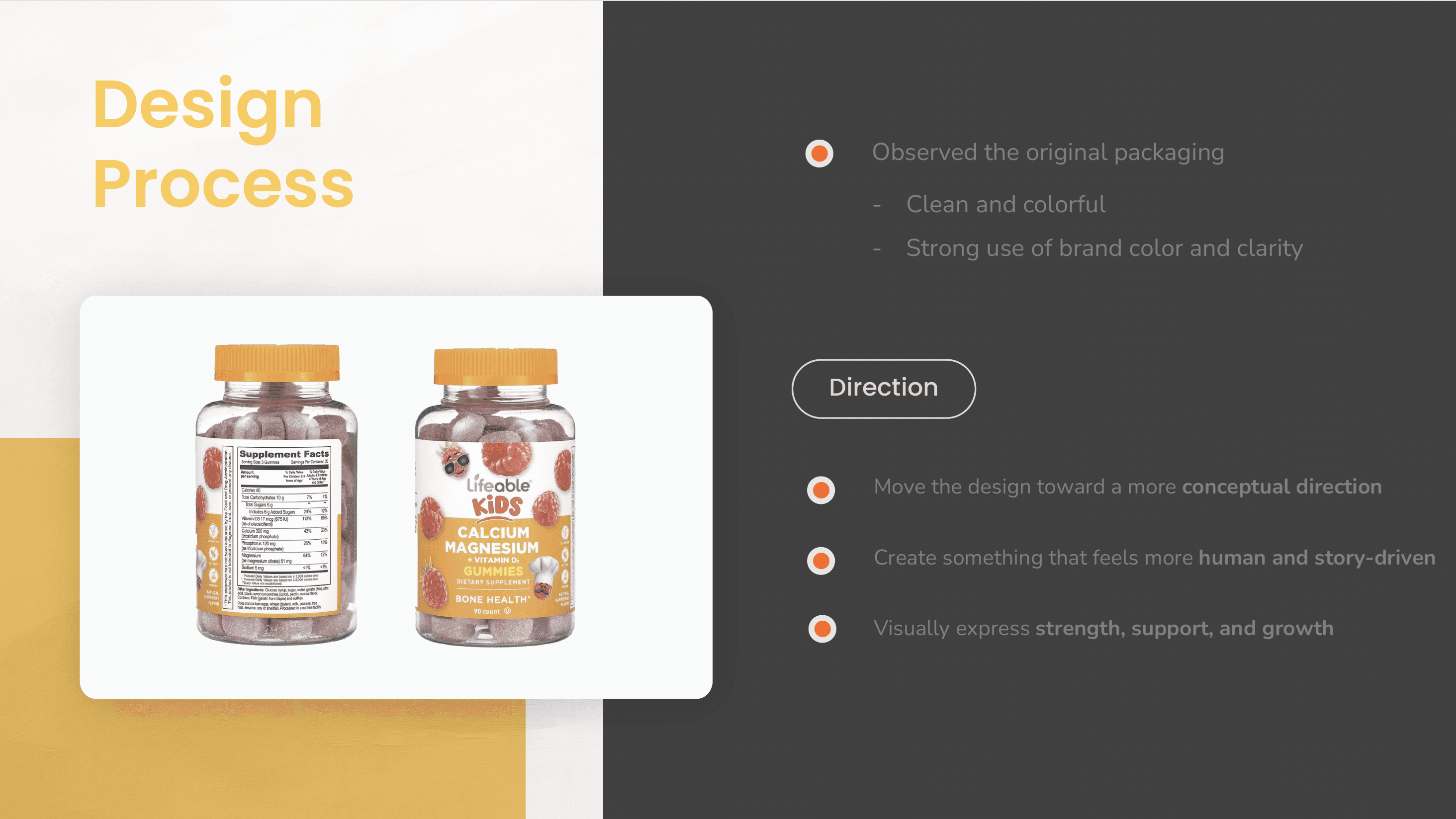
This project focused on redesigning the packaging illustration for Lifeable Kids Calcium Magnesium + Vitamin D3 Gummies. As a academic project, the goal was to create a compelling visual identity that appeals to both children and their caregivers. The final design needed to reflect the product’s playful nature while communicating health benefits in a trustworthy and visually engaging way.
Client
Academic Project (SCAD)
Duration
2 Weeks
Role
Graphic Design
Problem
The original Lifeable Kids packaging offered a good foundation, but there was an opportunity to strengthen its visual clarity and personality. The redesign explores a more playful illustration style and storytelling with a clearer hierarchy to help families quickly understand and recognize each vitamin type.
The challenge was to blend playfulness with credibility while clearly expressing the product’s health value.
Deliverables
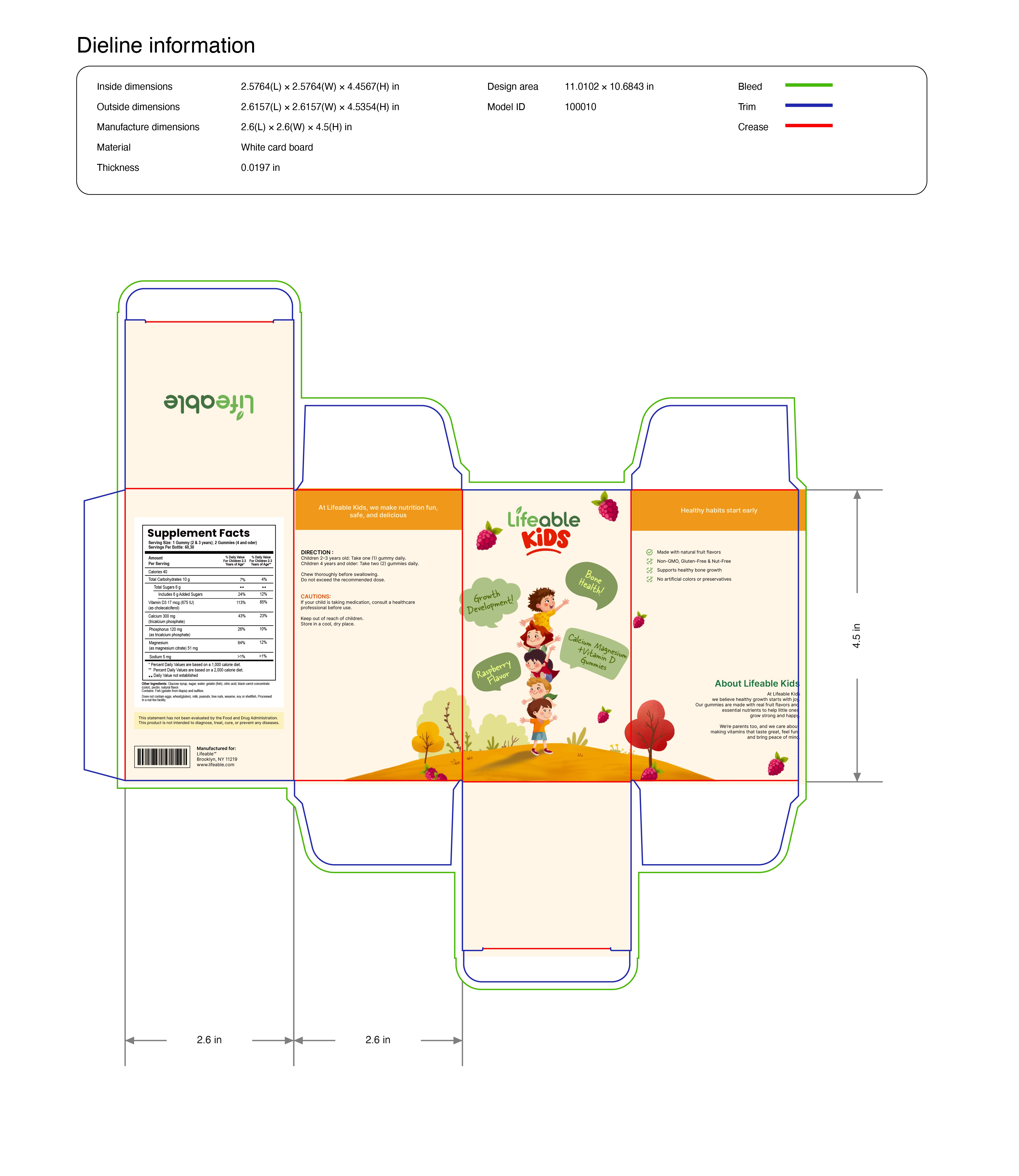
Full packaging redesign (front & back)
Research & process documentation
Character concept & illustrations
Value and color comps
Mockups
Process
1. Research & Audit
Reviewed the current Lifeable Kids packaging and identified issues: weakness, consistency, limited child appeal, and unclear vitamin differentiation.
Moodboard & Visual Direction
Collected visual references to explore tone, color palettes, illustration styles, and character concepts. Defined a playful and approachable direction that would guide the redesign.
Concept Exploration
Sketched a series of illustrated creatures representing a different vitamin type through playful shapes, soft colors, and a slightly dimensional flat style. Explored multiple compositions with an emphasis on friendliness and simplicity.
Visual System Development
Developed a unified style across characters, typography, and colors. Created a hierarchy that improved parent readability while keeping the design engaging for children.
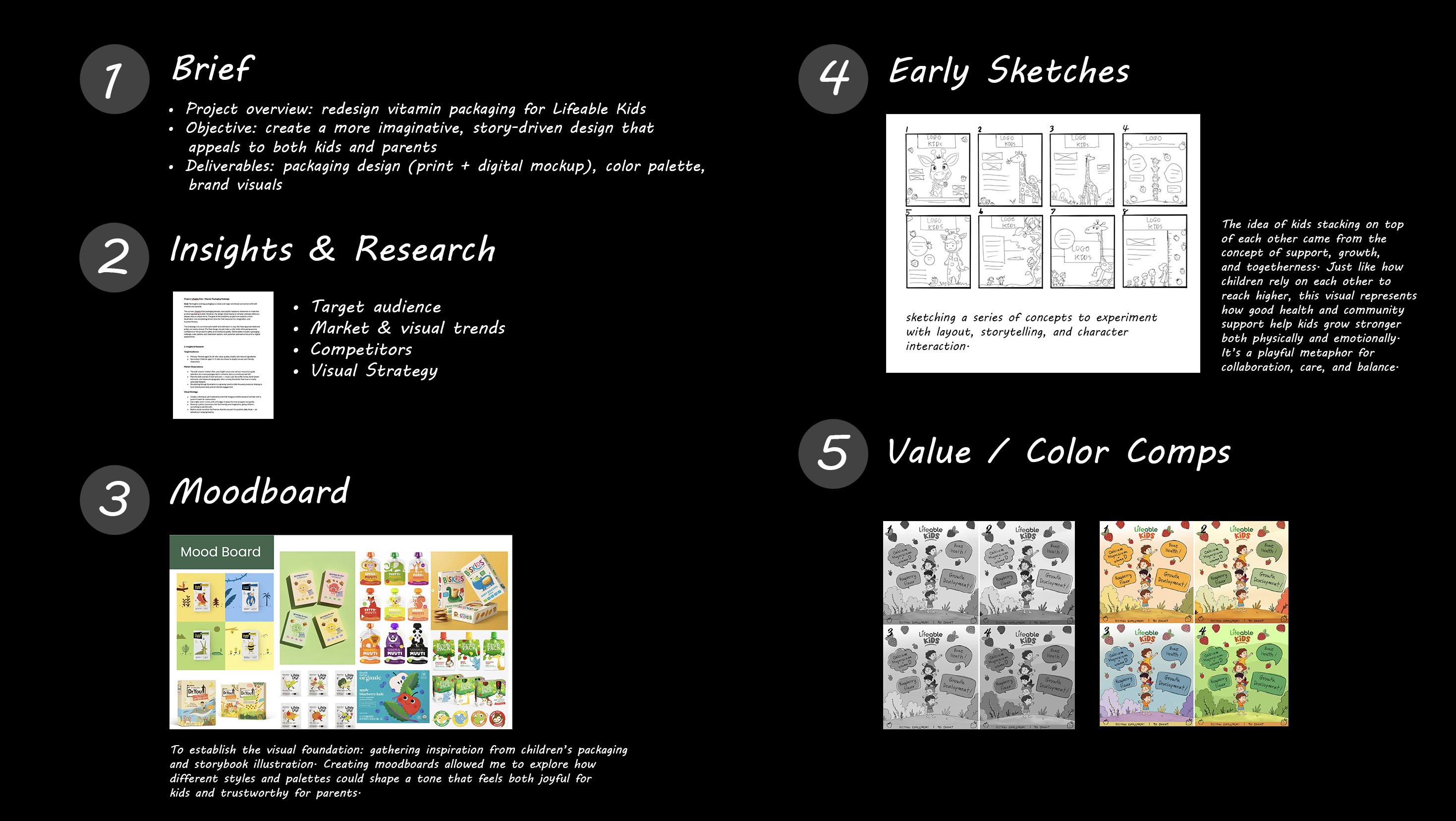
Packaging Layout Redesign
Redesigned the layout to emphasize the character, clarify information, and create a cleaner, more readable structure.
Digital Illustration & Refinement
Finalized character illustrations with soft gradients and expressive poses, maintaining consistency across line weight, texture, and color palette.
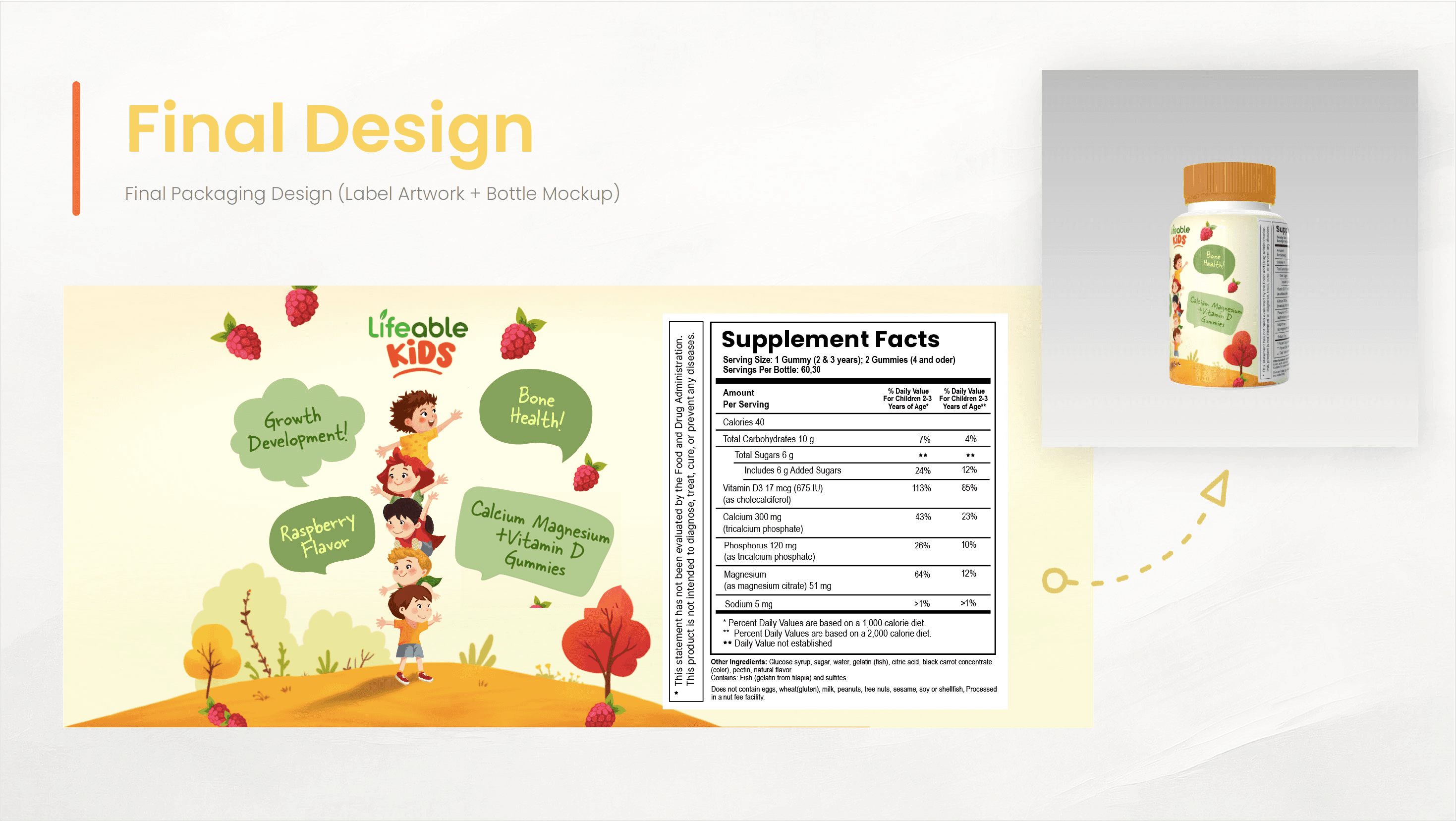
I also extended the redesign to include the outer package, completing the full packaging system.
Tool Used
Adobe Illustrator ✦ Adobe Photoshop ✦ Procreate